

How are you probably reading this right now? Chances are, it’s on your phone. This isn’t just a hunch; it’s a reflection of how the vast majority of people access the internet today. More and more, the world is going mobile. If your business website isn’t designed to look and function perfectly on smartphones and tablets, you’re not just annoying visitors—you’re actively losing potential customers. This is precisely why mobile-first design isn’t just a trend; it’s a fundamental necessity.
What Exactly is Mobile-First Design? (In Simple Terms)
In the early days of the internet, websites were built for large desktop screens, and mobile versions were often an afterthought. They were either “shrunk down” or offered as a completely separate, often limited, experience.
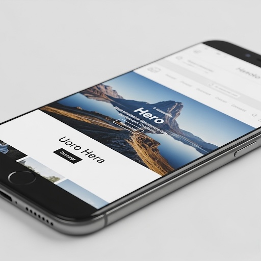
Mobile-first design flips that script. It means we design and build your website starting with the smallest screen (the mobile phone) first. We focus on prioritizing the most essential content and functionality for that compact space. Only once the mobile experience is optimized do we then scale up the design for tablets and larger desktop screens. This approach ensures that your core message and calls to action are always front and center, no matter the device.
The User Experience (UX) Imperative: Keep Your Customers Happy
Imagine trying to navigate a website on your phone where the text is tiny, images are cut off, buttons are impossible to click, or you have to pinch and zoom just to read anything. Frustrating, right? Most people would hit the “back” button faster than you can say “bad design.”
A poor mobile experience drives potential customers away. When your site is responsive and easy to use on any device, visitors stay longer, explore more, and are far more likely to take the next step, whether that’s making a purchase, filling out a form, or giving you a call. A seamless user experience reflects positively on your brand, showing that you value your customers’ time and convenience.
The Google Factor: How Mobile-Friendliness Impacts Your Search Ranking
It’s not just about keeping customers happy; it’s about getting found in the first place. Google, the world’s leading search engine, officially uses mobile-first indexing. This means that when Google decides how to rank your website in search results, it primarily looks at the mobile version of your content.
If your site isn’t mobile-friendly, it can severely hurt your visibility in search results, especially for the massive number of people searching from their phones. Essentially, if Google can’t easily “read” and understand your mobile site, it will be less likely to show it to potential customers. For any business aiming to grow online, appearing high in search results is non-negotiable.
Future-Proofing Your Website: Adaptability is Key
The world of technology is constantly evolving, with new devices and screen sizes emerging regularly. By adopting a mobile-first design philosophy, you’re not just ready for today’s devices; you’re building a more resilient and adaptable website that can easily adjust to the screens of tomorrow. This forward-thinking approach simplifies future maintenance and updates, ensuring your website remains effective and relevant for years to come.
Conclusion: Don’t Let Your Website Cost You Business
In today’s mobile-dominated world, having a website that looks and performs flawlessly on every device isn’t an option; it’s a fundamental requirement for success. Investing in mobile-first design is an investment in user satisfaction, better search engine visibility, and ultimately, your business’s growth.
Is your website ready for the mobile world? If you’re unsure, or if you’re ready to ensure your online presence is seamless and effective on every device, let’s talk about a responsive design strategy. Contact me today for a free consultation!
 English